Ok, I'm a fan of the Virgin brand. It's fun, versatile, adaptable and manages to stick to its brand concept...along those lines Virgin is planning to launch a range of 4-star quality hotels, for the high - end traveler, trust them to find an area in which there is scope for potential development..!
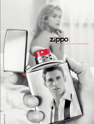 |
| Zippo Fragrance |
Speaking of brand consistency, or in-consistency in this case Zippo is planning to extend into fragrances (say what?!). Zippo is known for its lighters, in fact there is an entire brand community based around the Zippo brand, so when they decided to expand into candle lighter's, it was not great but ... ok especially when compared to fragrances. Sure there are not gonna be any brand communities around the candle lighter (yes even if its themed), but fragrances are such a diversion from their core brand, which is about a certain culture & style. But maybe I'm being overly critical. If done correctly maybe the transfer of brand ideals would be successful, as it depends on the characteristics of their target market as well as how they identify with their brand, although if they are not careful, Zippo might just be the next Ed Hardy.
 |
| ING's Charles |
Brand representations, as I like to call it, is how people view your brand, which might not be the same thing as what companies intend to portray..so I'm not sure where ING was going with this....ING are a strong financial brand, and in Australia they decided to change their brand ambassador from Billy Connolly (the comedian), to a talking orangutan. Now if you're anything like me, my first question was why would you use a comedian to promote a financial product?? Sure, humor in advertisements is great, but who would take a comedian seriously especially when selling insurance! Sounds like a bad joke to me...so naturally my second question is why use an orangutan instead?..no matter how smart he may appear to be. If played correctly ING have the potential to develop him into brand mascot, which could be quite memorable.
| GAP - Old & New logo |
Logos play a very important part of brand representation, as they are the one stop for brands to convey what they stand for to consumers. Recently GAP tried to redesign their logo, and i say try as the end result was quite dismal to say the least. The GAP logo is iconic and classic, it has stood the test of time and is easily recognizable, so why would you want to change it?? Especially since its not part of an overall re-branding campaign but an attempt to encourage customer involvement with the brand, by asking them to comment on the new brand and to go one step further by designing their own logo. Normally I would say increased engagement and participation by customers is brilliant, but the logo is one of the most important ways through which a company can represent itself so why leave it in the hands of people who may not understand what the company is all about? Although to be fair any one who would go through the trouble of designing a logo would have to be highly involved, but it also encourages others with not so favorable views to air what they think as well.
Branding is a tricky topic and its not easy getting it right.

0 comments:
Post a Comment