Showing posts with label GAP. Show all posts

What's in a Brand? Logos


What's in a Brand?: Is it defined by its Logo? OR even its Font?!

Starbucks' New Logo
Starbucks is still making news in regards to its logo change. Some are critics calling it too radical as it  alters  its trademark style and color combination which it has fought so hard to protect, as well as gets rid of all words going only with its mermaid icon. While I'm quite sad
 to see the distinctive color combination go, on the other hand I quite like the new direction. Starbucks has become such an iconic brand that it no longer needs to mention its name for people to recognize it, the mermaid in itself in quite recognizable and by focusing on it only its able to convey what the brand is. Another plus is that by removing 'coffee' from its name they are no longer restricting their brand to be viewed only as a 'coffee' house (although that is its primary produce) but it acts as a signal that its shifting into a lifestyle brand where it is to be viewed as a product to be consumed for leisure as it shifts into making available other drinks, as well as to be found on supermarket shelves.


While I feel Starbucks' logo change has been successfully carried out, I cannot say the same for the many other logo changes that have been cropping up (and yes there have been many). In these disturbed times, companies often feel that re-branding themselves to appeal to changing audiences always has to start with a change in logo design and I'm not sure why. A logo should only be changed if it provides added meaning, and recently a lot of brands have changed their logo design to no additional advantage, and even to an extent where it can be harmful to them. A few examples include: NBC, Seattle's Best Coffee, Kraft Foods and of course GAP. All of these have removed the distinctiveness of their logos and in such the distinctiveness of their brands. For eg: NBC's peacock symbolized that it was the first to offer color and sure it may not be relevant now, but it meant something and based on it, they were able to build strong brand. Ok so it may not have any value at the moment, but what does removing it achieve?....Nothing....!

Nokia New font & old font
Some companies like Nokia are even going so far as to change their font in order to "re-brand". Sure a font is important...but not when its one of the few (or only) changes made to help keep a brand afloat. Also it does not help when you can't tell the difference between the old and new fonts...unless you look really really hard. Nokia was good, Nokia was great! and we have all owned a Nokia at some point or another, but it is my personal belief that they need a lot more to help the brand rather than just a negligible font change. The main reason Nokia lost out was because they could not keep up so I'm going to wait and see what else they have up their sleeve as part of their re-branding strategy.

On special mention, I have to give a heads up to Lacoste who are trying to protect their logo and quite literally. Lacoste is a supporter of the 'save your logo' project which aims to encourage companies to support endangered species which act as a logo. A commendable project which not only does good but also says a lot about a brand and its commitment, and everyone wins!

Consistency (re)looked

One of the most fundamental aspects of managing a brand is its consistency, if an image needs to be maintained it can only be achieved if its done so from angle internally as well as externally. Lately there seems to be a lot of buzz especially in 'Green' department, some companies go out of thier way to ensure they stick to their principles while others....well...not so much.


Electrolux's Green Vaccum
Hats off to Electrolux for ensuring thier new green model is actually green! They've been trolling the world's  oceans to collect plastic refuse in order to create thier new model, which is a good way to reuse waste as well as clean up our oceans. It may not seem a big deal but combined with thier use of social media to generate buzz about thier new products, it is definitley a strong foundation on which to build a green, environmentally friendly green brand.

General Motors seems to have taken a page out of Electrolux's books by recycling booms to soak up oil from the oil spill to make parts for the Volt...making the Volt more green??? GM is going all out! Not only that GM is also recycling or reusing 97% of its waste which depicts an overall commitment to the environment...so now they just have to ensure all thier other cars are green as well...you can't get more committed than that!!


There is a fine balance to be maintained between brand extensions & consistency, and Oprah is one person who has managed that very well, especially with her extension into her own network, OWN, as long as her network hosts the ssame type of shows which she has been involved in and is line with her magazine, her fan base and brand consistency can be sucessfully maintained.


On the other hand there are some brands who do not maintain thier consistency very well, one such example I came across was KFC, who recently removed the 'Fried' from thier name in a bid to appear more healthy. From surveys conducted it was found that people viewed chicken to be a helathier version than beef which would KFC a natural advantage, but by having upsized combo meals and 'breadless' sandwiches does not confirm this healthy image.


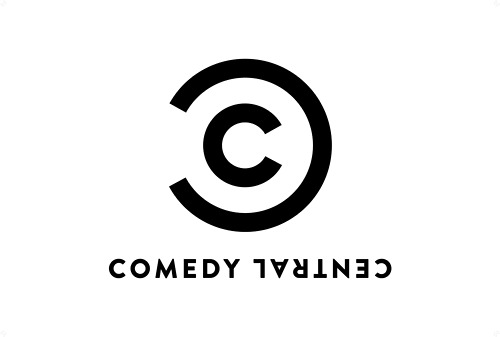
Anotheer inconsistency is the Comedy Central new logo......its a coomplete reverse of their original colorful, whacky one, where the colors are dark, serious, formal and what looks like to be an altered copyright symbol...was that done intentionally?? not sure, but for one thing it does not convey the fun, and laughter which is what the channel is all about.

And finally, we all have a lesson to be learnt from GAP, don't say something which is not true, as the customer will find out! GAP's promotional bags for thier feed USA campaign proudly boast the line 'Made in the USA', when the tag clearly reads otherwise....'Made in China', now if this is not a classic case of in-consistency I cannot find a better example.

Consistency & Representation


Ok, I'm a fan of the Virgin brand. It's fun, versatile, adaptable and manages to stick to its brand concept...along those lines Virgin is planning to launch a range of 4-star quality hotels, for the high - end traveler, trust them to find an area in which there is scope for potential development..! 


Zippo Fragrance
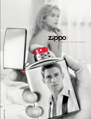
Speaking of brand consistency, or in-consistency in this case Zippo is planning to extend into fragrances (say what?!). Zippo is known for its lighters, in fact there is an entire brand community based around the Zippo brand, so when they decided to expand into candle lighter's, it was not great but ... ok especially when compared to fragrances. Sure there are not gonna be any brand communities around the candle lighter (yes even if its themed), but fragrances are such a diversion from their core brand, which is about a certain culture & style. But maybe I'm being overly critical. If done correctly maybe the transfer of brand ideals would be successful, as it depends on the characteristics of their target market as well as how they identify with their brand, although if they are not careful, Zippo might just be the next Ed Hardy. 


ING's Charles
Brand representations, as I like to call it, is how people view your brand, which might not be the same thing as what companies intend to portray..so I'm not sure where ING was going with this....ING are a strong financial brand, and in Australia they decided to change their brand ambassador from Billy Connolly (the comedian), to a talking orangutan. Now if you're anything like me, my first question was why would you use a comedian to promote a financial product?? Sure, humor in advertisements is great, but who would take a comedian seriously especially when selling insurance! Sounds like a bad joke to me...so naturally my second question is why use an orangutan instead?..no matter how smart he may appear to be. If played correctly ING have the potential to develop him into brand mascot, which could be quite memorable. 


GAP - Old & New logo
Logos play a very important part of brand representation, as they are the one stop for brands to convey what they stand for to consumers. Recently GAP tried to redesign their logo, and i say try as the end result was quite dismal to say the least. The GAP logo is iconic and classic, it has stood the test of time and is easily recognizable, so why would you want to change it?? Especially since its not part of an overall re-branding campaign but an attempt to encourage customer involvement with the brand, by asking them to comment on the new brand and to go one step further by designing their own logo. Normally I would say increased engagement and participation by customers is brilliant, but the logo is one of the most important ways through which a company can represent itself so why leave it in the hands of people who may not understand what the company is all about? Although to be fair any one who would go through the trouble of designing a logo would have to be highly involved, but it also encourages others with not so favorable views to air what they think as well. 


Chevrolet in an aim to reposition their brand, or in other words to develop a strong position for themselves, are trying to find a niche for themselves in the market. In response, their campaign focuses on images from their old campaign, in an aim to remind people why they used to love Chevy so much...which is cute and nostalgic, but its a technique used more to reassure and support your existing customers rather than position yourself in the market. 


Branding is a tricky topic and its not easy getting it right.